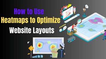
Introduction
The layout of your website is crucial to how users engage with your content. An effective layout can guide users seamlessly through your site, while a poorly designed layout can lead to frustration, confusion, and ultimately, a higher bounce rate. One of the most powerful ways to understand how visitors interact with your website is by using heatmaps.
Heatmaps provide visual data that show you exactly where users click, how far they scroll, and what areas of your site attract the most attention. This data can be crucial for improving your website’s design and layout. By understanding user behavior through heatmaps, you can make informed decisions about where to place important content, how to optimize calls-to-action (CTAs), and which areas need more attention to keep visitors engaged.
In this post, we’ll dive deep into how heatmaps work and how you can use them to optimize your website’s layout for better engagement and conversion rates.
What Are Heatmaps and Why Are They Important?
Heatmaps are a data visualization tool that helps you understand how users interact with your website. They translate user behavior into visual color gradients, with “hot” areas (often represented in red or orange) showing where users are most engaged, and “cold” areas (represented in blue or green) indicating where interactions are minimal.
There are several types of heatmaps you can use to analyze different aspects of user behavior on your website:
Types of Heatmaps
-
Click Heatmaps: These heatmaps track where users are clicking on your page. They help you identify which elements—buttons, images, links, or navigation bars—are getting the most attention. By understanding which areas are clicked most often, you can make strategic decisions about where to place critical elements like CTAs, contact forms, or product links.
-
Scroll Heatmaps: Scroll heatmaps show how far down the page users scroll. This type of heatmap can help you understand whether users are reading all of your content or abandoning the page before they reach key sections. It’s particularly useful for long-form content and pages with a lot of information, like blog posts or product descriptions.
-
Mouse Movement Heatmaps: These heatmaps track where users move their mouse across the screen. While it’s not always an indication of clicks, mouse movement data can tell you where users are focusing their attention. This is particularly useful for understanding user behavior in relation to images, videos, or text that might be part of your content.
-
Attention Heatmaps: Attention heatmaps analyze where users spend the most time on a page. They track the areas that attract the most visual attention, which can help you prioritize content placement or even adjust the design to make important sections more noticeable.
Why Heatmaps Matter
Heatmaps are essential tools because they allow you to:
- Identify user engagement: By highlighting the areas of your website that are attracting the most attention, heatmaps help you identify which parts of your site are working well and which need improvement.
- Optimize content placement: By analyzing scroll and click patterns, you can understand where to place your most important content or CTAs to maximize engagement.
- Make informed design decisions: Heatmaps provide actionable data that can be used to adjust your website layout, improving the overall user experience and driving higher conversion rates.
How to Use Heatmaps to Optimize Your Website Layout
Once you have a heatmap tool in place, it’s time to analyze the data and make adjustments to your website layout. Here are some practical ways to use heatmaps to optimize your site:
1. Analyze Click Patterns for Engagement Insights
Click heatmaps are one of the most valuable tools when it comes to understanding how users interact with your website. By tracking the areas where users click, you can identify which elements are driving interaction and which might need a redesign.
Key Insights from Click Heatmaps:
- Prioritize CTAs: If your call-to-action buttons (like “Buy Now” or “Sign Up”) aren’t receiving enough clicks, heatmaps can help you figure out why. Are the buttons too small? Are they located in an area where users aren’t looking? Consider making the buttons larger, using contrasting colors, or placing them in more prominent positions.
- Optimize content: If users are clicking on content that’s not meant to be interactive, you may need to adjust the design to clarify what’s clickable and what’s not. For example, if people keep clicking on an image thinking it’s a link, consider making the image clickable or adding a clear CTA.
- Reevaluate navigation: If users are clicking repeatedly on areas of your site that don’t lead anywhere (like static text or logos), this could indicate a navigation issue. Consider streamlining your navigation bar or adding more prominent links where users expect them.
Example: You notice a cluster of clicks on a product image that isn’t a clickable element. This suggests that users are interested in learning more about that product. You could add a clickable link to the image, directing users to the product page for more details.
2. Refine Content Layout with Scroll Heatmaps
Scroll heatmaps provide critical insights into how far users are engaging with your content. If visitors are abandoning your page before reaching important content, it may be time to adjust your layout.
Key Insights from Scroll Heatmaps:
- Content visibility: If users aren’t scrolling down far enough to see critical sections of your page (such as CTAs, product details, or contact forms), consider moving those elements higher up on the page. This ensures that visitors are exposed to the most important content without having to scroll too much.
- Page length optimization: If you have a long page with lots of content, scroll heatmaps can show you where people drop off. Break the content into more digestible chunks or incorporate engaging visuals like videos, images, and infographics to keep users interested as they scroll.
- Above-the-fold real estate: Ensure that the most important elements—like your headline, primary CTAs, and value propositions—are placed above the fold. This is the part of the page that users see without scrolling.
Example: If you’re running an e-commerce site, and users stop scrolling after viewing the first few products, consider showing a smaller selection of products at the top and then gradually revealing more items as they scroll.
3. Leverage Mouse Movement Heatmaps for Attention Tracking
Mouse movement heatmaps track how users move their mouse across the page, which can help you understand what areas users are paying attention to, even if they don’t click.
Key Insights from Mouse Movement Heatmaps:
- User focus: If users are lingering their mouse over specific images or sections of your page, it’s an indication that those areas are catching their attention. Use this information to further optimize those sections by making them more interactive or prominent.
- Enhance engagement: Areas that users hover over but don’t click might need better visual cues or additional calls to action. If users hover over a product but don’t click it, consider adding a “Learn More” button or additional information that encourages interaction.
Example: You notice that users are frequently hovering over an image gallery but not clicking. Adding captions, tooltips, or clickable links to the images could encourage users to engage more actively with this section.
4. Identify Low Interaction Areas for Improvement
One of the most important insights you can gain from heatmaps is understanding which areas of your website are getting little to no interaction. Low engagement doesn’t necessarily mean the content is bad—it could be a sign that it’s not positioned properly or isn’t as appealing as it could be.
Key Insights from Low Interaction Areas:
- Reassess layout and design: If certain areas aren’t receiving attention, it may be because the design is confusing or cluttered. Simplify the layout and make sure the most important sections stand out.
- Reevaluate content placement: If certain content sections aren’t being clicked or viewed, consider moving them to more prominent positions or revising the content to make it more engaging.
- Reduce distractions: Unnecessary elements—like excessive pop-ups, sidebars, or banners—might be detracting from the user experience. Remove or streamline these features to focus the user’s attention on the most important parts of the page.
Conclusion
Heatmaps provide invaluable insights into how users interact with your website. By carefully analyzing these insights, you can make data-driven decisions to optimize your site’s layout, enhance user engagement, and improve conversion rates.
Using heatmaps to track click patterns, scroll behavior, and mouse movements allows you to understand exactly where users are engaging with your site and where they’re losing interest. Armed with this data, you can prioritize key content, optimize CTAs, and refine your design to create a more seamless and intuitive user experience.
If you haven’t already, start using heatmap tools like Hotjar, Crazy Egg, or Lucky Orange to begin tracking and optimizing user interactions. These tools provide easy-to-interpret data that can help you make significant improvements to your website’s design.
At MDA Websites, we specialize in helping businesses optimize their websites for maximum engagement and conversions. If you need assistance in analyzing your website’s performance and implementing heatmap insights, reach out to us for expert guidance and solutions.