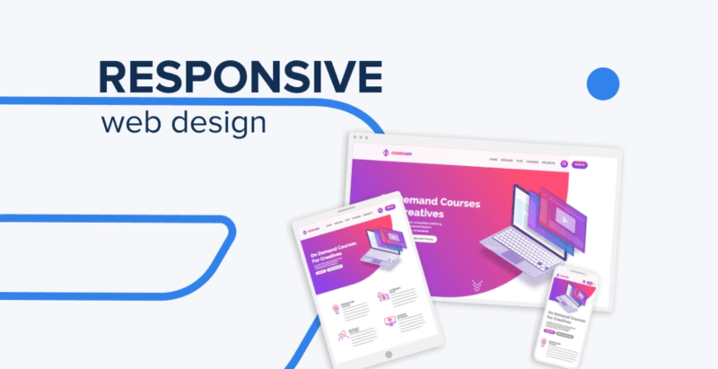
In 2024, the necessity of responsive web design is more crucial than ever. With users accessing websites from an ever-growing range of devices—from smartphones and tablets to desktop computers the need for a website that seamlessly adapts to different screen sizes has become imperative. Google’s mobile-first indexing underscores this urgency, prioritizing sites that deliver a unified and smooth experience across all devices.
Why Responsive Design Matters
Responsive web design is essential for enhancing user experience (UX). It ensures that your website provides a consistent and intuitive interface, regardless of the device being used. This adaptability prevents issues like excessive scrolling or content cut-off, leading to a more enjoyable and frustration-free browsing experience. Such seamless interactions not only improve user satisfaction but also drive engagement and conversion rates.
SEO Benefits
A responsive design is also a powerful asset for SEO. Google’s algorithms favor sites that offer a cohesive experience on both mobile and desktop devices. By consolidating your SEO efforts into a single, responsive site, you eliminate the need for separate mobile versions and streamline indexing efficiency. This not only helps in achieving higher search rankings but also prevents issues related to duplicate content and redirects, enhancing your overall SEO performance.
Mobile-First Era
With mobile devices driving the majority of web traffic, adopting a mobile-first approach is now essential. This strategy focuses on optimizing the mobile user experience before expanding the design to larger screens. By prioritizing mobile design, you cater to the largest segment of web users, ensuring your site performs well across all platforms.
Future-Proofing
Responsive design is a proactive approach to future-proofing your website. It allows your site to adapt to new devices and screen sizes without the need for frequent redesigns. This flexibility ensures that your site remains functional and visually appealing as technology evolves, reducing the need for constant updates and maintaining a consistent user experience.
Global Accessibility
Responsive design enhances global accessibility, ensuring that your site is functional and visually consistent for users worldwide, regardless of their device or screen size. This inclusivity broadens your reach and demonstrates a commitment to providing an optimal user experience for a diverse audience.
Competitive Edge
A responsive website sets you apart from competitors with outdated or non-responsive designs. It signals to potential customers that your business values user experience and modern web practices, boosting your brand’s reputation and attracting more customers.
Conclusion
As we navigate a multi-device world in 2024, responsive web design is not just a trend but a necessity. It ensures your site adapts seamlessly to various screen sizes, improving UX, enhancing SEO, and future-proofing your online presence. By embracing responsive design, you position your business for sustained success and growth in an increasingly digital landscape.